

Been a while since my last post. There are a few reasons for that but one of them is because I have been working on this dashboard and I think I am in a spot where I am comfortable sharing.
Why you should use this dashboard:
- Rooms: Everything organized into room cards using areas.
- Dynamic: Will automatically grow and categorize each room into sections as you add devices./entities.
- Clean layout: Extremely clean and almost feels like it could be it's own mobile app.
Cards:
Status-Card
Area-Card-Plus
Stack-In-Card
Bubble Card
Card-Mod
mini-graph-card
Mushroom
Markdown
Tile
Horizontal Stack
Firemote
Integrations:
Pirate Weather
Unraid API
Plex
Radarr
Sonarr
QbitTorrent
Github Repo: https://github.com/Wh1t3Rose/My-Home-Assistant
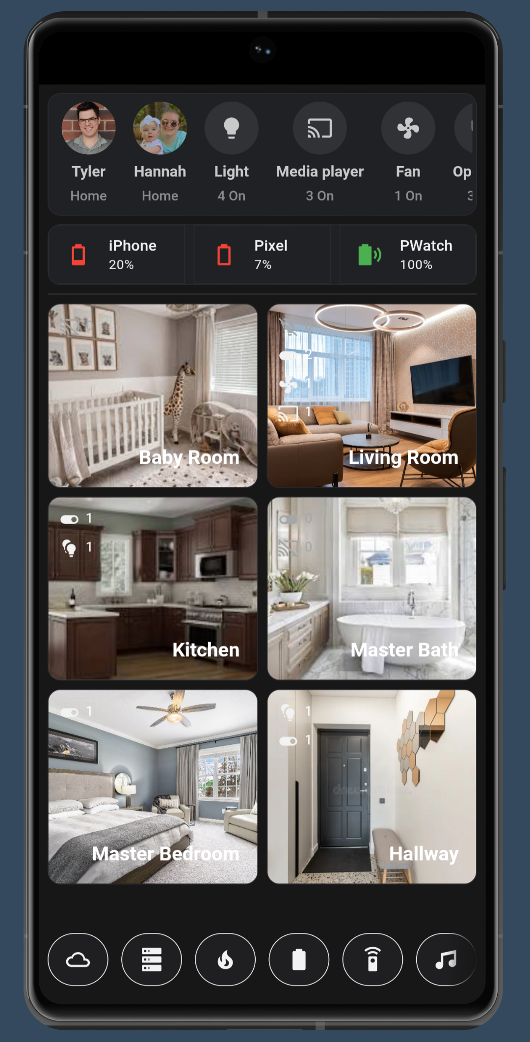
The Home View:
The home page from top to bottom is consisted of a Status card, a Area Plus card, and a horizontal card.
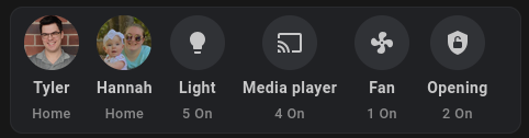
The top status card is completely dynamic. It changes based on things such as turned on lights, fans, doors, etc. If there things you wish if it to not include you can exclude those in the card as well. For example you may not want it to show media player count. You can exclude the media domain from the card settings. It is all configurable via the UI.
content:
  - light
  - media_player
  - vacuum
  - fan
  - Binary Sensor - vibration
  - Binary Sensor - moisture
  - Binary Sensor - opening
  - input_boolean
type: custom:status-card
columns: 4
hide_person: false
list_mode: false
hide_content_name: false
customization: []
hide_filter: Entity
The device charging bar consists of a Stack-In-Card. Inside the Stack-In-Cards are tile cards for each device
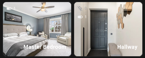
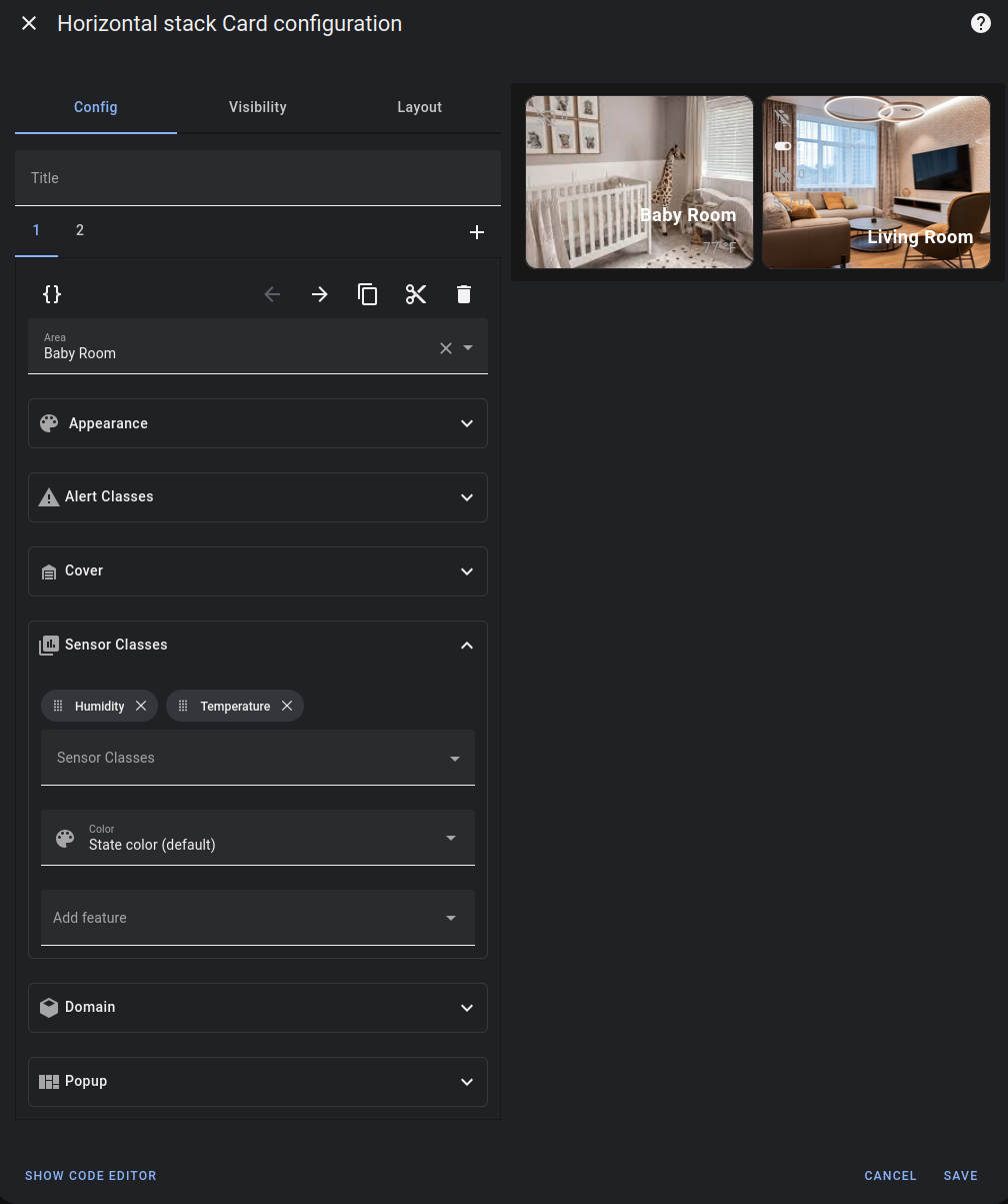
The room cards consist Area-Card-Plus cards. I have customized these slightly using card_mod to have photos for each card. replace the URL with your own image link.
card_mod:
  style: |
    ha-card {
      background-image: url('https://custom-url.com/master-bedrooms-featured.jpg');
      background-size: cover;
      background-position: center;
      height: 300px;
      color: white;
      height: 300px;
    }
The room cards have support to show various entity status on the cards themselves and is configurable. For example you can show how many lights, and other devices are on in those rooms as well as the temperature and humidity in those rooms provided you have the sensors in those rooms and have assigned to to the correct area in Home Assistant
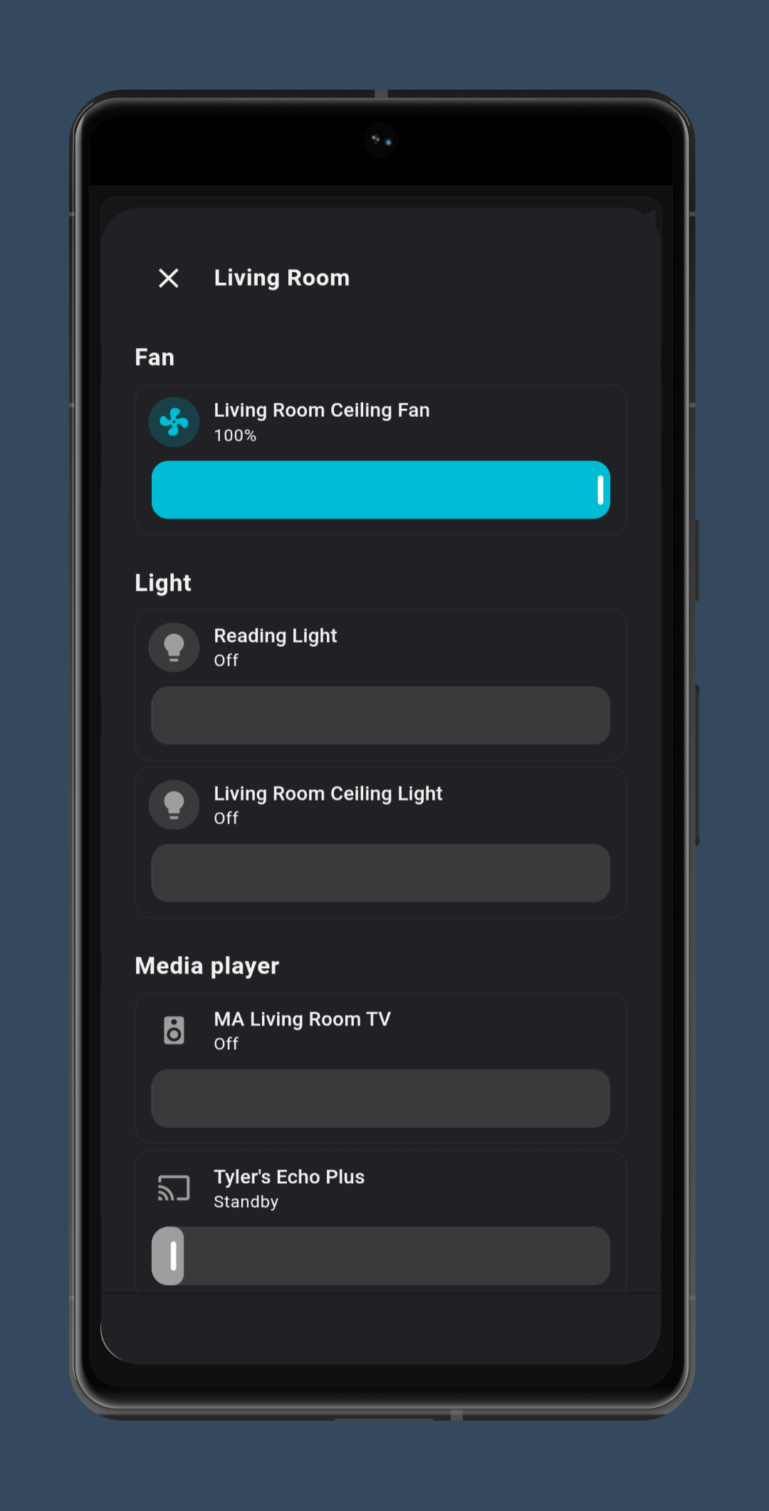
Finally is the bottom bar. The way this works is you first create your Bubble cards. The buttons when clicked/tapped will open these cards in full screen mode.
Here is an example:
type: vertical-stack
cards:
  - type: custom:bubble-card
    card_type: pop-up
    hash: '#kitchen'
    name: Kitchen
    icon: mdi:fridge
    entity: light.kitchen
The Pop-up Card
A button that opens the pop-up
type: custom:bubble-card
card_type: button
button_type: name
name: Kitchen
icon: mdi:fridge
button_action:
  tap_action:
    action: navigate
    navigation_path: '#kitchen'
The button that opens the card
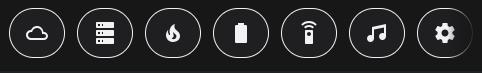
The full bottom bar card I use in my dashboard
type: vertical-stack
cards:
  - type: custom:bubble-card
    card_type: horizontal-buttons-stack
    hash: "#weather"
    name: Weather
    icon: mdi:weather-cloudy
    entity: light.kitchen
    1_link: "#weather"
    1_icon: mdi:weather-cloudy
    auto_order: false
    2_icon: mdi:server
    2_link: "#server"
    3_link: "#network"
    3_icon: mdi:fire
    4_icon: mdi:battery
    4_link: "#battery"
    5_link: "#remote"
    5_icon: mdi:remote
    6_link: "#music"
    6_icon: mdi:music
    7_icon: mdi:cog
    7_link: http://192.168.1.3:8123/config/dashboard
Bottom Nav Bar Card
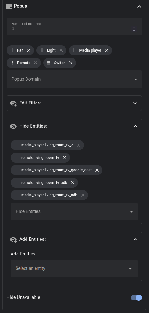
The Room Card is configurable in the Gui via the "Pop-up" config section Here you can assign "domains" like lights to create your toggles for all the lights assigned to that area in HA. You can also hide entities that are assigned to your given area you may not want to actually show up in the room card.
Also there is a toggle to hide unavailable entities which is very useful!
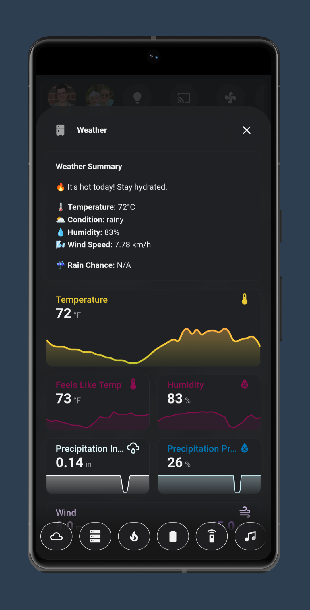
The Weather Card:
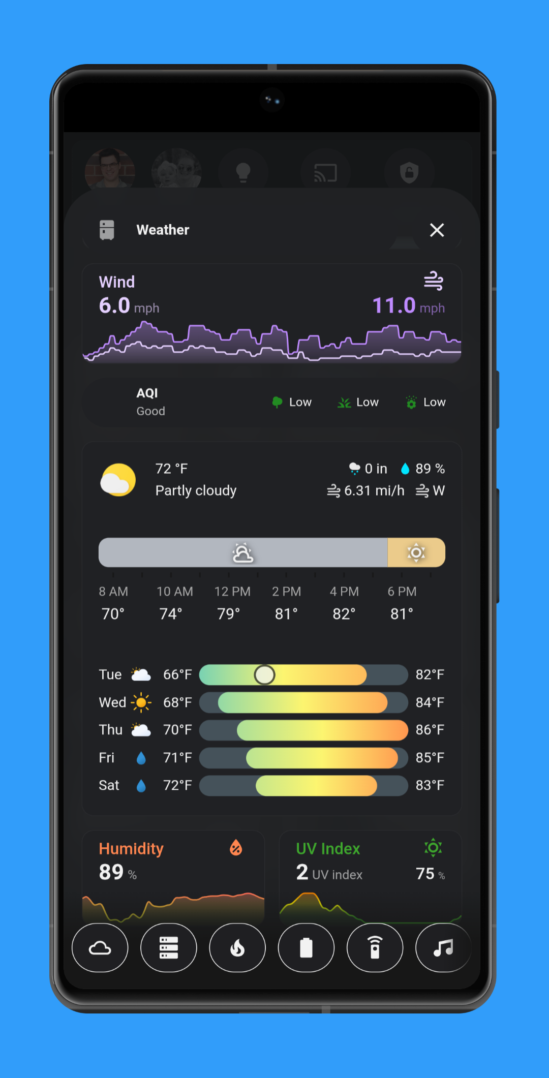
This card is a combination of a bunch of mini-graph cards inside a vertical-stack card with a markdown card for the top "Weather Summary" card.
Here is the code for the "Weather Summary" Card:
type: vertical-stack
cards:
  - type: custom:bubble-card
    card_type: pop-up
    hash: "#weather"
    name: Weather
    icon: mdi:fridge
    entity: light.kitchen
  - type: markdown
    content: |2-
        **Weather Summary**

        {% if state_attr('weather.pirateweather', 'temperature') | default(0) < 10 %}
        🥶 It's cold outside! Dress warmly.
        {% elif state_attr('weather.pirateweather', 'temperature') | default(0) > 30 %}
        🔥 It's hot today! Stay hydrated.
        {% else %}
        🌤️ It's a pleasant day. Enjoy!
        {% endif %}


        🌡️ **Temperature:** {{ state_attr('weather.pirateweather', 'temperature') | default('N/A') }}°C
        🌥️ **Condition:** {{ states('weather.pirateweather') | default('N/A') }}
        💧 **Humidity:** {{ state_attr('weather.pirateweather', 'humidity') | default('N/A') }}%
        🌬️ **Wind Speed:** {{ state_attr('weather.pirateweather', 'wind_speed') | default('N/A') }} km/h

        {% set forecast = state_attr('weather.pirateweather', 'forecast') %}
        {% if forecast and forecast[0] %}
        ☔ **Rain Chance:** {{ forecast[0].precipitation_probability | default('0') }}%
        {% else %}
        ☔ **Rain Chance:** N/A
        {% endif %}
Again the rest of the cards are just mini-graph cards that are pulling data from my Weather Integration: Pirate Weather
You can find the rest of the code for this card on my Github,
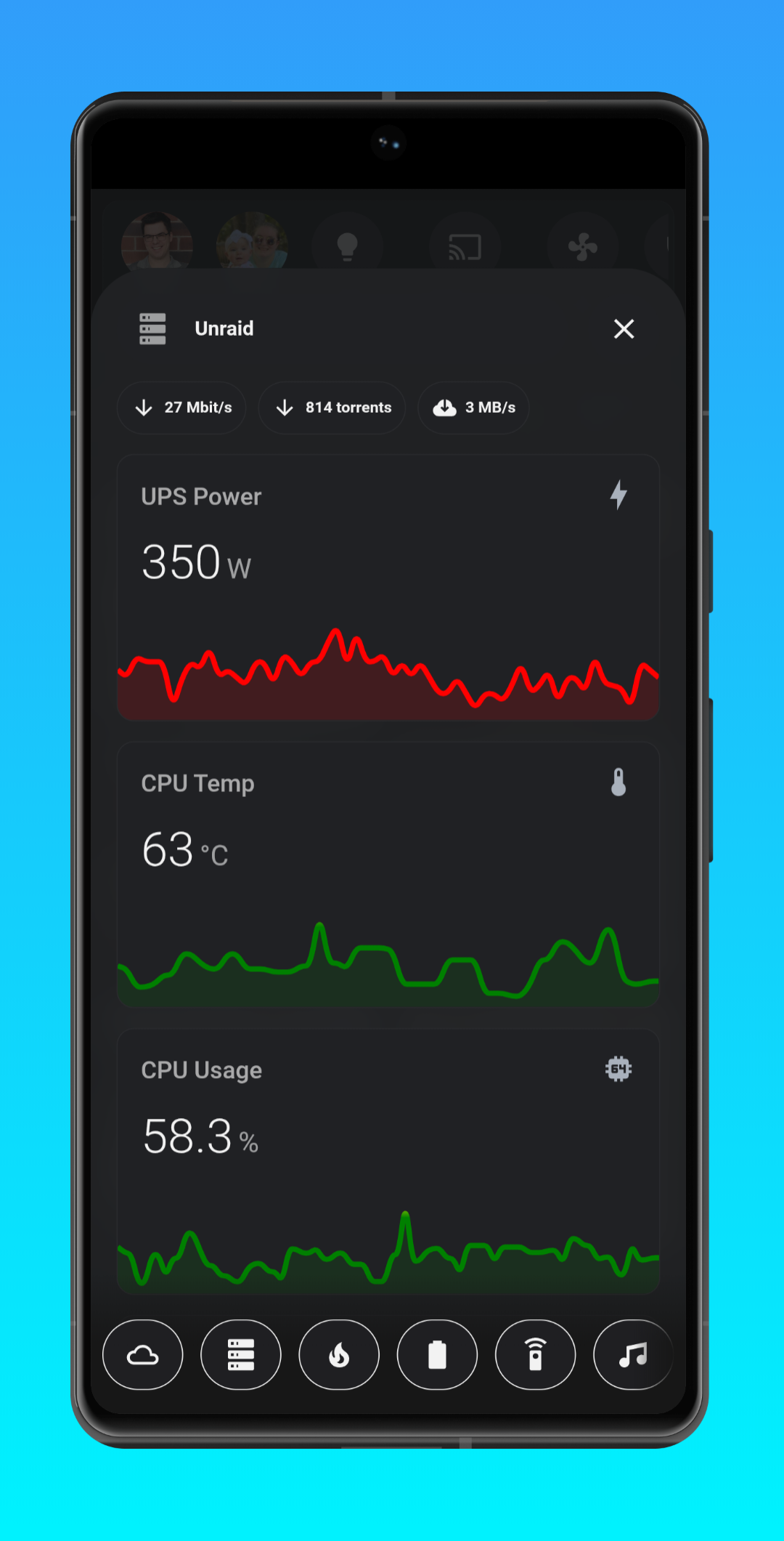
The Server/Network Card:
I use Unraid for my NAS Os of choice. With that comes an API Integration. So I am pulling my server data from that and just displaying it in various mini-graph cards inside a Bubble Card that is wrapped inside a vertical stack card as usual. My Network card is pretty identical just with different Mushroom Chips for the status of my Unfi network gear.
Here is an example of the mini-graph card for CPU Temp:
type: vertical-stack
cards:
  - type: custom:bubble-card
    card_type: pop-up
    hash: "#server"
    name: Unraid
    icon: mdi:server
  - type: horizontal-stack
    cards:
      - type: custom:mushroom-chips-card
        chips:
          - type: entity
            entity: sensor.unraid_tower_bond0_inbound
            name: Inbound
          - type: entity
            entity: sensor.qbittorrent_all_torrents
            icon: mdi:arrow-down
          - type: entity
            entity: sensor.qbittorrent_download_speed
  - type: custom:mini-graph-card
    entities:
      - sensor.ups_power
    name: UPS Power
    icon: mdi:lightning-bolt
    color_thresholds:
      - value: 70
        color: green
      - value: 75
        color: yellow
      - value: 90
        color: red
    show:
      graph: line
    hours_to_show: 3
    points_per_hour: 20
Here is just the Mini-Graph card:
type: custom:mini-graph-card
entities:
  - sensor.ups_power
name: UPS Power
icon: mdi:lightning-bolt
color_thresholds:
  - value: 70
    color: green
  - value: 75
    color: yellow
  - value: 90
    color: red
show:
  graph: line
hours_to_show: 3
points_per_hour: 20
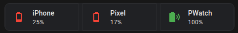
The Sensor Battery Card:
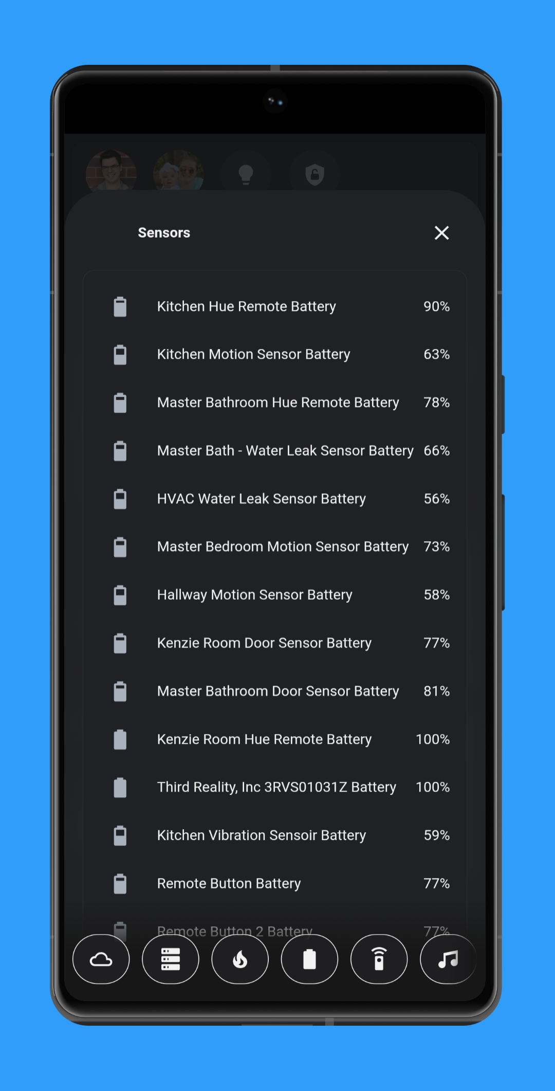
This one is simple. It just lists all the battery entities. However there are some devices I didn't want the battery level listed. For me most of my sensors are from one Manufacture: Aqara. This made it easy for me to filter things out. I just had to filter out Apple and Google as I didn't want our phones/watches listed here.
type: vertical-stack
cards:
  - type: custom:bubble-card
    card_type: pop-up
    hash: "#battery"
    name: Sensors
  - type: custom:auto-entities
    card:
      type: entities
    filter:
      include:
        - options: {}
          entity_id: "*battery*"
          device_manufacturer: aqara
        - options: {}
          attributes:
            device_class: battery
        - options: {}
          state: ""
      exclude:
        - options: {}
          device_manufacturer: Google
        - options: {}
          device_manufacturer: Apple
        - options: {}
          entity_id: "*ups_battery*"
        - options: {}
          state: unavailable
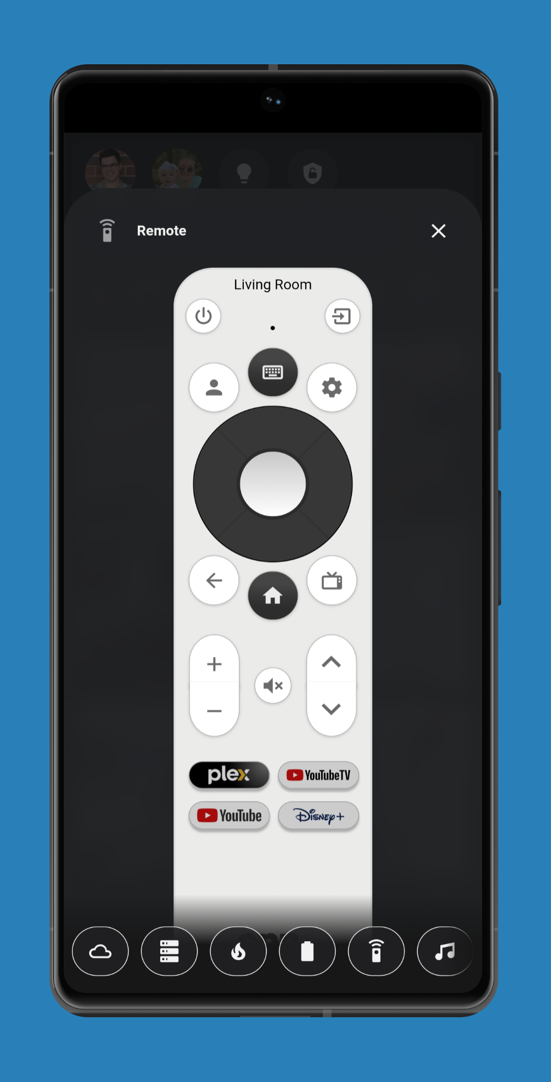
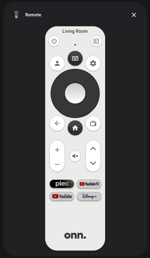
The Remote Card:
This one is simple. Just a remote card to control our TV. Our 2 year old is always running off with the remote and leaving it somewhere. I have given up. Parents you know. So we use this as a backup.
The card use the FireMote card for the image of the card itself and buttons.
type: vertical-stack
cards:
  - type: custom:bubble-card
    card_type: pop-up
    hash: "#remote"
    name: Remote
    icon: mdi:remote
  - type: custom:firemote-card
    entity: media_player.living_room_tv_adb
    device_family: onn
    device_type: onn-4k-streaming-box
    compatibility_mode: default
    android_tv_remote_entity: remote.living_room_tv
    defaultRemoteStyle_override: ""
    app_launch_1: plex
    app_launch_2: youtubeTV
    app_launch_3: youtube
    app_launch_4: disney-plus
    visible_name_text: Living Room
    name_position: top
Making it Full Screen:
Add this code to the top of your lovelace YAML to make the dashboard fullscreen!
kiosk_mode:
  mobile_settings:
    hide_header: true
    ignore_entity_settings: true
    custom_width: 768